If you have been staring at your dye collection wondering what goes with what, this post is for you. I tested eight different tie dye color combinations — some on spirals, some on geodes, some on gravity dye projects — and I am breaking down exactly what I used, how it turned out, and what I would do differently. Whether you love bright and bold or moody and muted, there is something here for you.

A Note Before You Start
One of the most important things to know about choosing tie dye colors is avoiding complementary colors next to each other on spirals. If you put yellow next to purple, or red next to green, you are going to get brown where they blend. Keep that in mind as you plan your color placement and you will save yourself a lot of frustration.
Stuck knowing how to fold your project? Check out this free ebook.
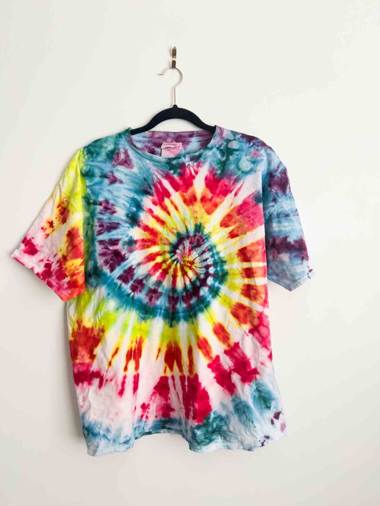
Combo 1: Spanish Lavender, Kingfisher Blue, Lime Pop, Tangerine and Hot Hibiscus
This one went on a spiral. Spanish Lavender is a special edition color from Dharma, but Sweet Pea is a similar option if you cannot find it. Kingfisher Blue is a brighter teal — I ended up using a lot of it, so the finished shirt leaned heavily teal, which I actually loved. Lime Pop rounds it out with a bright punch of yellow-green. There is not a great Dharma substitute for Lime Pop, but Pro Chemical and Dye and Dyespin both carry lime options that might be comparable.
Tangerine is an orangey color that splits yellow — really unique, and I do not know of a Dharma equivalent. Hot Hibiscus is a bright, punchy pink. If you have Hot Pink from Pro Chemical, that is a close match. The finished result with the lime and the tangerine and the hibiscus together was so good.
Combo 2: Ice Blue and Alchemist
This one is best suited for ice dye specifically because Alchemist is an ice dye color — it is a purple and blue splitter and I genuinely do not know what will happen if you use it with liquid dye. Ice Blue is a light blue with a slight purple split. Together on a geode with dye under the ice, the result was soft, muted, and really pretty. More pastel than bold, which makes it a nice contrast to some of the brighter combos.

Combo 3: Tangerine and Amethyst
This was a gravity dye project and one of my favorites in the whole video. Amethyst is a bold, jewel-toned pink-purple and it is stunning next to Tangerine. The finished result read a little more pink than purple, but it was gorgeous. This combo would also work really well with liquid dye if you are not an ice dye person.

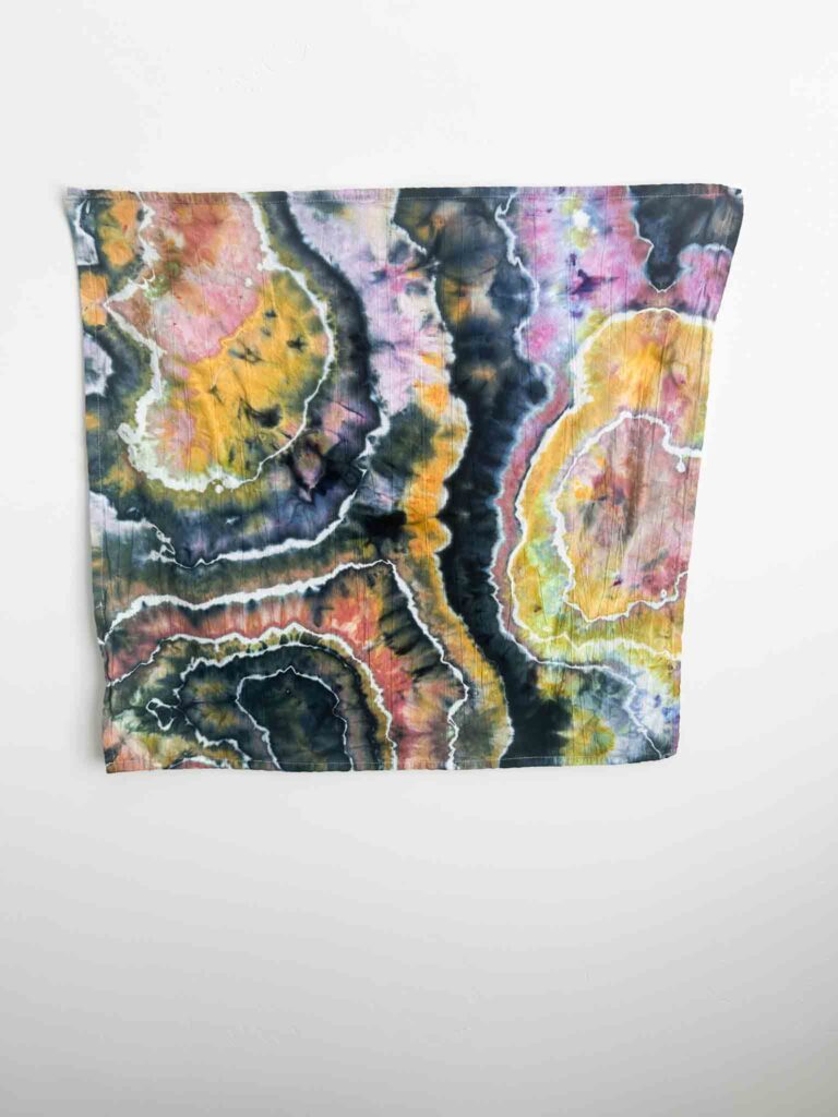
Combo 4: Raven, Hydrangea, and Chartreuse
I will warn you upfront — this is a unique combo. But it is so fun. Raven went under the ice on the sinew lines of a geode, Hydrangea (similar to Lavender if you have that instead) went on next, and Chartreuse — which is like a darker, greener version of Lime Pop — finished it off. The result was unexpected and really cool. The dark black on the sinew lines made the whole thing pop.
Combo 5: Leaf Green, Chino, Loaden, and Chocolate Brown
All four of these are Pro Chemical and Dye colors. I was going for a camo look and this combination delivered — Leaf Green, Chino (a coffee tone), Loden (a mossy green), and Jacquard Chocolate Brown, which is a very true brown with no splitting at all. This combo works well with liquid dye too, which makes it a great option if ice dye is not your thing.
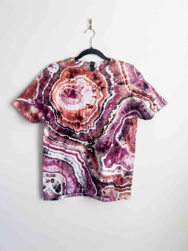
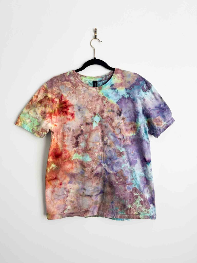
Combo 6: Dances with Raisins, Black Cherry, and Terracotta
This one is warm and moody without feeling warm, if that makes sense. Dances with Raisins is more of a bright purple-red than a classic maroon. Black Cherry is darker with a deep red hue. Terracotta is that familiar orangey-red. Together they are a little bit monochrome but the finished shirt still felt rich and complex. All three would translate well to a liquid dye project.
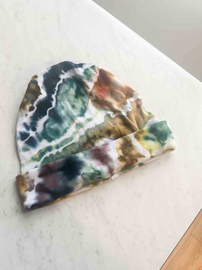
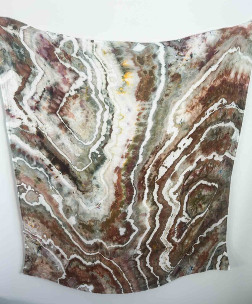
Combo 7: Shiitake Mushroom, Sage Green, and Rattlesnake
I was going for forest with this one. Shiitake Mushroom is an ice dye color that will not behave the same way in liquid dye, so keep that in mind. Sage Green is a true, pretty sage that I reach for constantly. Rattlesnake looks more brown than the swatch suggests — there are some green splits, but it is mostly brown. The result was prettier than I expected, but more brown than green. Next time I would add more Sage or a Pro Chemical Leaf Green to push it greener.
Combo 8: Phoenix Flame, Kaleidoscope Eyes, and Alchemist
These are all ice dye specific colors, so this combo is for ice dyers only. Phoenix Flame is an orange that splits green — cool, but a little wild on its own. Kaleidoscope Eyes is a green and blue splitter with some yellow in it. Alchemist, which I love, holds everything together. Keeping these colors in their own zones rather than blending them gave a really striking result.
Final Thoughts on Choosing Tie Dye Colors
The biggest lesson from testing all of these tie dye colors together is that you do not have to stick to one brand. Some of the best combinations in this video mixed Dharma, Pro Chemical and Dye, Dyespin, and Jacquard all in the same project. Buy the color that is right for what you are going for, not just what the brand you already have.
Want to see all of these come to life? Watch the full video above.
Find all my favorite dyes and supplies in my Amazon storefront. Shop one-of-a-kind tie dye pieces in my Etsy shop.
Thank you very much for this practical and very useful advice on color mixing (noted by someone who dyed a few brown t-shirts a few years ago…)
Hey we’ve all been there!